The Evolution of the Geode Logo
From pins to hexagons.
Every brand has a story. Ours is one of transformation, clarity, and getting to the heart of what matters. The Geode Solutions logo has evolved over time - not just in design, but in meaning. Join us on a visual journey through our brand identity, from our earliest days to today’s modern mark.
📍 It all started with a pin (2013)
In 2013, Geode Solutions was founded with a mission to help clients navigate complex digital and technical landscapes. Our first logo reflected this quite literally.

A soft red map pin encased the bold letter G, anchoring the name "GeoDE Solutions" in place and purpose. The design was straightforward and symbolic - a visual marker saying, “We’re here to help you find your way.”
The playful mix of uppercase and lowercase typography carried an intentional message: the capital D and E stood for Data and Engineering. These weren’t just buzzwords - they were the foundation of how we worked. We understood the technical landscape deeply, but we didn’t stop there.
From the very beginning, Geode was about:
- Helping clients navigate complexity
- Getting to the core of the issue
- Bridging technical expertise with business impact
This original logo might look simple today, but it captured a powerful intent: to bring clarity to complexity and make digital transformation real.
🎨 From point to platform (2021)
By 2021, Geode had expanded beyond helping clients find their direction. We were no longer just about wayfinding - we had become a partner in delivery. Our focus had shifted to enabling clients to move from insight to action: building systems, delivering strategy, and aligning technology with business needs.
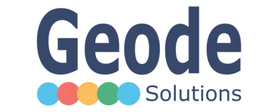
This evolution was reflected in our second logo. The familiar map pin was replaced by a bold, versatile identity. “Geode” now led the brand with confidence, while “Solutions” provided a quiet but steady anchor. Five colourful dots represented the diverse dimensions of our work:

The map pin gave way to a vibrant, versatile identity. “Geode” now led the brand, with “Solutions” playing a supportive role below. Five colourful dots marked stepping stones along our journey:
- Sky blue: fresh thinking
- Coral red: bold moves
- Amber yellow: clarity
- Verdant green: sustainable outcomes
- Cyan: innovation and energy
This logo reflected our shift from orientation to orchestration. We were no longer just helping people find their way - we were helping shape the way forward, bringing people, processes, and platforms into alignment. The color, energy, and simplicity marked Geode’s move from a consulting start-up to a trusted strategic partner.
🧩 To the core and beyond (2025–Present)
Today, the Geode brand reflects more than capability - it reflects clarity of purpose. Our latest logo is a bold, structured emblem of how we work: going deep, revealing the core, and creating lasting impact.

The new symbol is a concentric hexagon, inspired by the natural structure of a geode. It’s a visual metaphor for how we work: peeling back layers, engaging deeply with our clients, and solving the real problems - those hidden beneath the surface.
In short, it’s about getting to the core - of problems, of systems, and of what really matters.
The shift to this logo marks several key developments:
- A mature, confident identity aligned with our consulting ethos
- A deliberate focus on depth, not noise
- A flexible design system with both light and dark mode applications
- A move from visual metaphor to strategic clarity
Most importantly, it signals a company that works differently. At Geode, we:
- Collaborate with clients to get to the core
- Bring deep technical knowledge and business insight to every challenge
- Focus on what matters most: outcomes over optics
💡 Looking Back, Moving Forward
From the literal to the symbolic, from the surface to the core - our logo has evolved as we have. Each iteration reflects our growth: in capability, in purpose, and in how we deliver for our clients.
We’ve moved from dropping a pin to building lasting value. From navigating to enabling. From complexity to clarity.
Because at Geode, we don’t just advise.
We collaborate to uncover what matters.
Topics
Digital Strategy and Transformation Partner
Geode Solutions helps organizations design, fund, and deliver complex digital transformation initiatives. Our work spans strategy, architecture, procurement, delivery, and advisory services across Australia.